Part 3; Visuals Enhance Reach, Resonance, Cohesion, and Targeting.
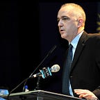
March of 2007. Backstage with the young presidential candidate. We peered out into the ballroom of 3500 people, each with our own porthole in the double swinging doors.
“I made an X on the ground halfway to the stage and I need you to stand on it and shake hands while facing the press riser,” I said.
He paused. “And why?” he asked. He was figuring me out and I him.
“Because your entrance into this room is guaranteed to be used in coverage of this event, and over this door is the flag of Florida. Even someone in a crowded bar seeing footage on the news will know you were in Florida.”
He looked me up and down. “OK. 15 seconds.” And he went out and did it.
I share this because visuals can seep in where content, words, numbers, or policy cannot. We have to remember that some consumers or viewers will have only a 2–3 second interaction with the news we create Tuesday at 11am (Part 1 in our series https://rogerfisk.medium.com/tuesday-11am-is-the-best-time-to-make-news-heres-why-79cd4395fbe7 ) and may never hear the words of the compelling speaking program we built (Part 2 https://rogerfisk.medium.com/how-to-construct-a-compelling-speaking-program-1f84b14f647e )
And this is why it is imperative that we use a harmonizing theme that simplifies the meaning of our announcement and hammers it home through every possible touch point and platform before, during and after our announcement Tuesday at 11am.
Here’s how I think; we have our target demographic we want to reach and persuade. Our examples have been faith leaders, millennials, or the business community. I always picture someone from our target demo waking up Wednesday morning after attending our event, or they saw the news coverage we worked so hard to get as well as some of the social media content we mobilized in our post-event amplification. If we are good, really good, we might have 1–2 concepts swimming around the sleepy head of our target demo that Wednesday morning.
Our challenge is to design all components of our Tuesday@11 in a way that drives our core point home and gives us a chance of occupying some of that precious mental real estate.
In Part 2, I talked about working with all your speakers to have a common theme run through their remarks. This is not a statistic or simply the name of the product announced, it is the importance and meaning of the announcement distilled to its absolute essence. If we announced a product that will help expand broadband into under-served areas, the elemental value of what we are talking about is Expanding Opportunity. Maybe our announcement was an environmental study about water quality, in which case we are talking about is Clean Water or better yet Healthy Families. If we are a financial institution and we introduced a new service for retirement savings, we are talking about A Stable Future. I trust you follow; we are not simply repeating the name of the product, we are trying to encapsulate what it means.
This phrase can drive our social media for weeks leading into our announcement, and the phrase should have a certain look; a specific font, specific colors, and this allows it to become an avatar for the value you are presenting. Many color schemes build on familiarity; the big local university’s colors, or the professional sports team. Those colors speak a language in which our audience is already fluent. And by using the same format and font across all material, we abide by the simple maxim that consistency + repetition=cohesion.
That visual phrase leads our press advisory sent out more than a week before our event, then at the head of our press releases day before and day of. At our venue, our signage, from where to park to the signs that reserve spaces for the press, all have our phrase on it, as does the interior signage to our event room. As our guests enter they are handed a program with the phrase on it, the press gets a more detailed packet similarly festooned, and both targets leaf through it as we brief our speakers backstage.
And the stage! Our podium has a sign on it about the size of a cafeteria tray with our phrase, font, and chosen color scheme, as well as a web address or hashtag. This is important because we want to make sure we are providing a way for anyone who sees images of our event to get involved, find out more, or access the product. Our backdrop is a larger version of the podium sign, maybe in a step and repeat style or single phrase with a web address or hashtag. Then our speakers come out and use their own words, stories and expertise to drive home our core phrase, be it Expanding Opportunity, Healthy Families, or A Stable Future.
We make sure the press who attends is aware that our speakers will be available for follow-up comments and interviews after our speaking program, and for that post-event interview we will plant our speakers on the floor right in front of the stage so any follow-up footage is still carrying our carefully planned visuals. You can also get 2–3 copies of the podium sign made and decorate a separate room, paying specific attention to a corner or specific space in that room for the follow-ups so the visual phrase gets captured in the post-event interview footage.
You can extrapolate all of this into our Amplification plan discussed in Part 1. Starting Tuesday afternoon, our allies and leadership call into key talk radio shows, the CEO’s op-ed we submitted last week gets published in a paper or on a site that is highly trafficked by our targets so it can accompany their morning coffee and tablet scrolling. Our social media follow-up is pushing media clips out to phones old and new.
By anatomizing each of these opportunities and maximizing their potential, we construct a broad, cohesive narrative that gives us a chance, just a chance, that a key member of our target demographic wakes up Wednesday morning and thinks, “Healthy Families. That’s a good thing they are doing.”
And that is how we reach, engage, and persuade.